
 This is the back cover of the catalogue. I created it on photoshop. The concept is basically the background from the cover image so it still has a unity as 1 catalogue. I used dry brush to make this back cover.
Tuesday, June 7, 2011
Task 3 (Digital) Catalogue Process 7
This is the back cover of the catalogue. I created it on photoshop. The concept is basically the background from the cover image so it still has a unity as 1 catalogue. I used dry brush to make this back cover.
Task 3 (Digital) Catalogue Process 6
 This is the last section of the catalogue and it basically explains about using the color adjustments for the picture. I put some pictures showing the location of the color adjustments and it also a good trick in using this kind of adjustment because you can also adjust the color on the layer that you want but I figured if you already adjust it on a particular layer, you can't change it back, so by creating a new adjustment layer, you can delete it, edit it and change the position of the layer without ruining the original work.
Task 3 (Digital) Catalogue Process 5
 This section explains about brush applications. I used different brushes for the hair and clothes so I explained it briefly how to use the brush. I also showed the brushes that I used in this picture so if anyone wants to try it, they can follow the instruction.
Task 3 (Digital) Catalogue Process 4
 This section explains about the coloring method and how to lay out the layers properly to get a good outcome. Also in addition it explains about how to apply other brush application, starts from selecting the brush up to putting it in the brush library. Some photoshop techniques also included in this section such as how to use the eyedropper tool and color panel. Tips and tricks such as playing with brush size and opacity plays an important role in this stage so I included that too to the catalogue.
Task 3 (Digital) Catalogue Process 3
 These are the next pages in the catalogue. Basically it explains about how to lay out the reference image, setting the brush, managing the layer and tracing the image with the brush. Also there are some tips just I mentioned before in my blog post that has been included in this catalogue. For the title and information, I gave a text box with a contrast color from either side of the page because these pages are going to be in the same section of the catalogue.
For the title, I decided to put the steps just to emphasize the role of every page because it's meant to be like a tutorial.
Task 3 (Digital) Catalogue Process 2
 This is the close up look on the inside of the catalogue. For the title I wrote "Brush Technique - Digital Painting (Photoshop)" because it focuses mainly on the brush application and also some techniques in digital painting. Some information also going to be explaining about how to use photoshop for some people that unfamiliar with this program. On this page, I tried to explain the reason why I chose this technique and also the difference between photoshop and illustrator.
 For the fonts, I chose Bauhaus 93 for the title and Century Gothic for the content because it's a basic font and it's easy to read. These fonts will be used throughout the catalogue. On the title, I gave a red strip to emphasize it and also it has a connection with the with the red blank page on the left hand side of this page.
Task 3 (Digital) Catalogue Process 1
 This is the overview of my catalogue. I decided to put colored backgrounds rather than backgrounds with pictures because it will disturbed the information. I tried to put a background just like the back cover on every page of the catalogue but it looks messy and disturbing so finally I decided to put basic colors based on my cover image. I chose red, black, blue, white, and yellow.
Monday, June 6, 2011
Task 3 (Digital) Process 4

 These are the final looks for my cover image. I created the background with dry brush and for the color I enhanced it a little bit with the layer adjustment to get the vibrancy from the color because if I leave it as it is, the color is very dark. I like colorful theme and bold colors so I adjusted the color a little bit with brightness/contrast and color balance. I guess I captured my theme quite well because it is just as I expected with bold colors, half portrait, abstract coloring just like splashes of paint, delicate face features and artistic looking.
Task 3 (Digital) Process 3

 The next step is putting down the hair and clothes. For the hair I changed the brush setting to create a different effect. I used dry brush application from the brush library on photoshop. I wanted to create an abstract feel so I did not put too much effort on the hair and the clothes. Just some splashes of paint to create the clothes with watercolor brush. I downloaded the brush from the web. I'll mentioned it on the catalogue but I'm not going to explain how to download the brush. Downloading the brush in photoshop is similar with the one in illustrator so I guess it's not necessary to explain it again on the catalogue. I'm also going to put how to change the brush setting on the catalogue.
Task 3 (Digital) Process 2

 These are the before and after the rendering stage. After the sketch is done, then I moved to the dropping colors stage. I put the colors based on the reference picture and then create a new layer on top of the sketch and color base layers and started rendering the face details. This is another step that I'm going to put in my catalogue so everybody can understand how it works. This stage can be tricky because if you lay out the layers in the wrong way, it will be harder to get this outcome. I've tried some tricks and I think this is the best way to get a good outcome of the rendering quality. I want to explain more about how to render it properly but I thought it will be too complicated and the catalogue space is limited so I'm just going to put the important bits such as how to change the brush settings, opacity, and laying out the layers.
Task 3 (Digital) Process 1
 First look on my project. I traced the reference picture with brush work. I used the skin color from the reference for the sketch so it's easier when it comes to the coloring. This is one of the technique that I'm going to put in my catalogue. I'll explain on how to set the brush and some tips in creating a digital painting with brush works.
Saturday, June 4, 2011
Reference Picture
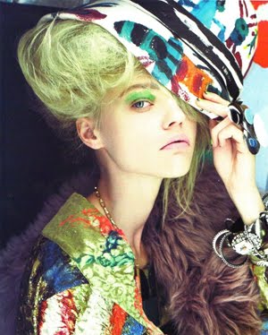 After doing some research for the reference picture, I decided to choose this one because of the lovely colors and the pose is just as I expected, half portrait with strong face features. I'm not going to do a full portrait for this task because I just want to get the fashion mood from my drawing and not focusing on the garment. So it will be like an illustration with an abstract colorings. I'll post my progress on the next blog.
Thursday, June 2, 2011
Task 3 (Digital) Research 3 - Favorite Artist


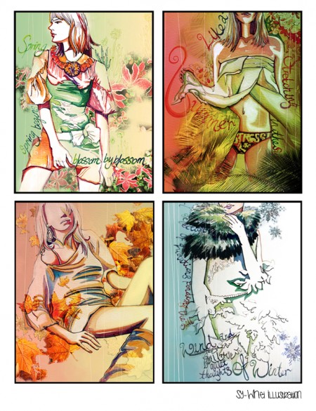
 These amazing artworks are from my favorite artist in "deviant art". She inspired me the most to learn about digital painting because of her gorgeous works. These are some examples of her artworks and I noticed a lot of them used different brushes application. This gives me an idea to use different brushes as my main technique. Moreover, she likes to draw portraits with bold colors and most of them looks like an oil painting or watercolor. I'm inspired to do something similar to these pictures but for fashion purpose.
Wednesday, June 1, 2011
Task 3 (Digital) Research 2

These are other examples of my technique from the research. I posted these just as reference and inspiration.
Task 3 (Digital) Research
 This is the first image that I chose from my research. I'm interested in digital painting because I've been learning to do it for 5 months now and I'm excited to use this skill for task 3.
 I took this picture from a google search for digital painting in fashion. I found that there are not many fashion illustration being done in digital painting. Most of them are hand rendered or using adobe illustrator. Therefore, I thought if fashion illustration being drawn in photoshop using the digital painting technique, it will be very interesting.
From this picture, it can be seen that digital painting is offering something different. It has a strong conceptual idea with an interesting layout such as the background, the color, and the figure.
The reason why I chose this technique because I felt more confident in photoshop rather than illustrator. I've been working in photoshop longer than in illustrator so I figured it has to be my own individual style and something different from others.
Sunday, May 8, 2011
For The Better Poster Process 5


This is the final outcome. I spent quite a while to get the font right and finally I picked the right font that suits the poster. It look a little bit like a handwriting on a piece of old paper with blotches of ink around it. For the written content, I changed the font so it could be read easily. I also gave an outer glow so it pops out better from the background. I changed the color balance to give a more contrast colors and to make it look vintage. The colors blend perfectly and I'm quite satisfied with the final outcome.
For The Better Poster Process 4

 For the background, I started to put down some colors first. The color that I pick has a brown tone and earthy to show the adventurous feel as it is been written in the brief. It also gave a classic vintage look. To gave more depth on the concept, I put a texture on the background and use the overlay effect so it blends nicely with the color that I put before. It looks like an old vintage paper and it suits to my concept perfectly. A nice, adventurous look to show that the garment allows an ease to be anywhere and everywhere.
For The Better Poster Process 3


The next step is to color the figure. I tried to pick the neutral and casual color as possible. I also added jacket and hat to give it a more fashionable look. So it looks like she can go anywhere and be everywhere with the simple yet chic outfit. The jeans meant to be like an acid washed jeans so I gave a little bit of texture on my brush to get the look.
For The Better Poster Process 2
 For this last poster, I decided to go back to photoshop. First as usual I traced out the picture. But this time I changed her outfit to fit the theme to the poster. I'm not sure this is right or not but I just followed the theme brief and there it described that the aim of the theme is to get ease anywhere and everywhere and pretty much the garment is casual with simple T-shirt, jeans, etc.
For The Better Poster Process
 This picture is going to be my reference for the figure on For the Better poster. I really like the pose and her face so I decided to use this one. For this theme, I'm not quite sure what I'm doing and up until now I'm still trying to guess what the theme is. But later I'll work it out somehow.
Saturday, May 7, 2011
For Fun Poster Process 4


For the background, I gave black and white to create a contrast and it also gave a more dynamic look. On the left, I gave the repetition of the figure's hair, just to accentuate the poster. for the content, I felt like I'm running out of space, but I did not want to change anything because I thought it already looks good so I put the theme of the poster on the left and right side. I also put a border on the back of the writings so it pops out from the background. For the font, I tried to find a fun looking font but then I ended up using this because I thought it looks really good in the poster. One thing that I don't really like is the writing content. I can't think of any other font for that one and I want it written with the same font from the title, so I just go with that one but it appears that the font is not so perfect. But overall I'm happy that I'm able to make this poster with illustrator. For me it's a big achievement and I will keep practicing my skill in illustrator.
For Fun Poster Process 3

 Next, I put down some colors for the garment. I tried to give fun and colorful color theme to match up with the theme. In my interpretation, fun is something cheerful and a little bit odd, therefore I did not think too much for the color. Just put whatever I like as long as it still looks good. Next, I began to give some addition to the garment. I purposely did not make anything that looks like an actual garment to obtain the fun look that I'm looking for. Just a simple scribble on the top, polkadots on the hem of the skirt, and stripes made out of little circles, i thought that it is already good. For the hair, I made it with some tools on illustrator. I know it is very basic and but I'm still the process of learning for illustrator and by far I'm quite happy that I actually can do it in illustrator too. Some splat of paints I got it from the brush library and I also tried to make a symbol. The triangle on the top right made out of symbols.
For Fun Poster Process 2
 This time I tried to use illustrator. I know the result will be completely opposite to the first one but I wanted to practice my skill for illustrator. First I traced the figure with pen tool. It was really time consuming and I felt like I'm almost giving up. But after a while I get the hang of it and it turned out quite well, even though it's not perfect.
For Fun Poster Process
 This is the second pose for my for fun poster theme. I finally picked this one because first I was attracted with the umbrella and it does give an excitement to the picture and I love that. The pose itself also a little bit awkward-which I liked it and therefore I decided to use this one for my poster.
Wednesday, May 4, 2011
Full Bloom Poster Process 5


This is the final outcome after I put the text and change the adjustment of the color. It looks colorful, classic, and feminine. For the font, I know it's a little bit Italic but I just thought the Italic is suitable for this theme so I just go with that. I also gave an outer glow for the text so it pops out from the background.
Full Bloom Poster Process 4


This is the background. I used watercolor brush to get the effect that I wanted. I tried to make it as colorful as possible but still very soft and feminine. The picture on the bottom, I added some bleeds to the object so it's like the picture blurs to the background. It looks warm and fresh like the spring time. I'm pretty satisfied with the outcome and I'm excited to see the text being applied to the poster.
Full Bloom Poster Process 3

 This is the shading of the drawing. I did not put too much detail so it's just a very simple rendering with brush. The second picture shows the shading a little bit more clearly. Next I'm going to put the background and additional text. I'll post it later.
Full Bloom Poster Process 2
 After the rough sketch, I started to put down colors to the drawing. This is just a base color and after this I'm going to the shading. I picked soft but colorful tone. For her dress, I just followed the reference picture's dress because I thought it was already beautiful so I'm not doing changes for that one. I'll post it later after I finished.
Full Bloom Poster Process

At first I can't decide whether I used photoshop or illustrator because I'm not sure which one is better for this theme and more importantly my skill in handling these programs. Finally I used photoshop because I'm more comfortable in it and also I've made quite a lot of digital paintings with this program so I'm confident to use photoshop at the end. This meant for full bloom poster. I wanted to create a watercolor feel for this one and also I used my digital painting skill for this one. First I drew the sketch first. My concept is spring time with a little fantasy of enchanted flower and a beautiful fairy, therefore I used the figure that I post on the previous one as the fairy on the middle of the flower. It shows that the flower is starting to bloom in the spring time and the fairy is coming out to greet the beautiful morning of spring. I read the themes from Couture Techniques but because I'm not taking that subject this semester so I tried my best to interpret it in my own imagination and concept.
Saturday, April 30, 2011
 This picture from Tim Walker's photography gave me an inspiration for the Full Bloom poster. I used this as the reference for my illustration. The pose is very unique, it's like she wants to reach something and the dress is pretty even though it doesn't show very clearly in this picture because I upload it in a small size.
Subscribe to:
Comments (Atom)