
 This is the back cover of the catalogue. I created it on photoshop. The concept is basically the background from the cover image so it still has a unity as 1 catalogue. I used dry brush to make this back cover.
Tuesday, June 7, 2011
Task 3 (Digital) Catalogue Process 7
This is the back cover of the catalogue. I created it on photoshop. The concept is basically the background from the cover image so it still has a unity as 1 catalogue. I used dry brush to make this back cover.
Task 3 (Digital) Catalogue Process 6
 This is the last section of the catalogue and it basically explains about using the color adjustments for the picture. I put some pictures showing the location of the color adjustments and it also a good trick in using this kind of adjustment because you can also adjust the color on the layer that you want but I figured if you already adjust it on a particular layer, you can't change it back, so by creating a new adjustment layer, you can delete it, edit it and change the position of the layer without ruining the original work.
Task 3 (Digital) Catalogue Process 5
 This section explains about brush applications. I used different brushes for the hair and clothes so I explained it briefly how to use the brush. I also showed the brushes that I used in this picture so if anyone wants to try it, they can follow the instruction.
Task 3 (Digital) Catalogue Process 4
 This section explains about the coloring method and how to lay out the layers properly to get a good outcome. Also in addition it explains about how to apply other brush application, starts from selecting the brush up to putting it in the brush library. Some photoshop techniques also included in this section such as how to use the eyedropper tool and color panel. Tips and tricks such as playing with brush size and opacity plays an important role in this stage so I included that too to the catalogue.
Task 3 (Digital) Catalogue Process 3
 These are the next pages in the catalogue. Basically it explains about how to lay out the reference image, setting the brush, managing the layer and tracing the image with the brush. Also there are some tips just I mentioned before in my blog post that has been included in this catalogue. For the title and information, I gave a text box with a contrast color from either side of the page because these pages are going to be in the same section of the catalogue.
For the title, I decided to put the steps just to emphasize the role of every page because it's meant to be like a tutorial.
Task 3 (Digital) Catalogue Process 2
 This is the close up look on the inside of the catalogue. For the title I wrote "Brush Technique - Digital Painting (Photoshop)" because it focuses mainly on the brush application and also some techniques in digital painting. Some information also going to be explaining about how to use photoshop for some people that unfamiliar with this program. On this page, I tried to explain the reason why I chose this technique and also the difference between photoshop and illustrator.
 For the fonts, I chose Bauhaus 93 for the title and Century Gothic for the content because it's a basic font and it's easy to read. These fonts will be used throughout the catalogue. On the title, I gave a red strip to emphasize it and also it has a connection with the with the red blank page on the left hand side of this page.
Task 3 (Digital) Catalogue Process 1
 This is the overview of my catalogue. I decided to put colored backgrounds rather than backgrounds with pictures because it will disturbed the information. I tried to put a background just like the back cover on every page of the catalogue but it looks messy and disturbing so finally I decided to put basic colors based on my cover image. I chose red, black, blue, white, and yellow.
Monday, June 6, 2011
Task 3 (Digital) Process 4

 These are the final looks for my cover image. I created the background with dry brush and for the color I enhanced it a little bit with the layer adjustment to get the vibrancy from the color because if I leave it as it is, the color is very dark. I like colorful theme and bold colors so I adjusted the color a little bit with brightness/contrast and color balance. I guess I captured my theme quite well because it is just as I expected with bold colors, half portrait, abstract coloring just like splashes of paint, delicate face features and artistic looking.
Task 3 (Digital) Process 3

 The next step is putting down the hair and clothes. For the hair I changed the brush setting to create a different effect. I used dry brush application from the brush library on photoshop. I wanted to create an abstract feel so I did not put too much effort on the hair and the clothes. Just some splashes of paint to create the clothes with watercolor brush. I downloaded the brush from the web. I'll mentioned it on the catalogue but I'm not going to explain how to download the brush. Downloading the brush in photoshop is similar with the one in illustrator so I guess it's not necessary to explain it again on the catalogue. I'm also going to put how to change the brush setting on the catalogue.
Task 3 (Digital) Process 2

 These are the before and after the rendering stage. After the sketch is done, then I moved to the dropping colors stage. I put the colors based on the reference picture and then create a new layer on top of the sketch and color base layers and started rendering the face details. This is another step that I'm going to put in my catalogue so everybody can understand how it works. This stage can be tricky because if you lay out the layers in the wrong way, it will be harder to get this outcome. I've tried some tricks and I think this is the best way to get a good outcome of the rendering quality. I want to explain more about how to render it properly but I thought it will be too complicated and the catalogue space is limited so I'm just going to put the important bits such as how to change the brush settings, opacity, and laying out the layers.
Task 3 (Digital) Process 1
 First look on my project. I traced the reference picture with brush work. I used the skin color from the reference for the sketch so it's easier when it comes to the coloring. This is one of the technique that I'm going to put in my catalogue. I'll explain on how to set the brush and some tips in creating a digital painting with brush works.
Saturday, June 4, 2011
Reference Picture
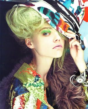 After doing some research for the reference picture, I decided to choose this one because of the lovely colors and the pose is just as I expected, half portrait with strong face features. I'm not going to do a full portrait for this task because I just want to get the fashion mood from my drawing and not focusing on the garment. So it will be like an illustration with an abstract colorings. I'll post my progress on the next blog.
Thursday, June 2, 2011
Task 3 (Digital) Research 3 - Favorite Artist


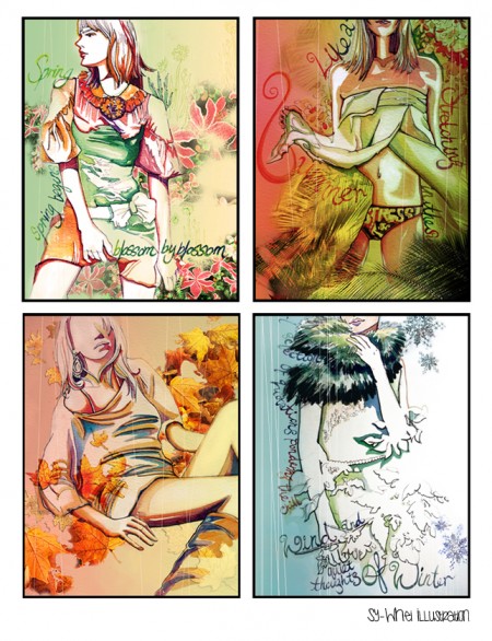
 These amazing artworks are from my favorite artist in "deviant art". She inspired me the most to learn about digital painting because of her gorgeous works. These are some examples of her artworks and I noticed a lot of them used different brushes application. This gives me an idea to use different brushes as my main technique. Moreover, she likes to draw portraits with bold colors and most of them looks like an oil painting or watercolor. I'm inspired to do something similar to these pictures but for fashion purpose.
Wednesday, June 1, 2011
Task 3 (Digital) Research 2

These are other examples of my technique from the research. I posted these just as reference and inspiration.
Task 3 (Digital) Research
 This is the first image that I chose from my research. I'm interested in digital painting because I've been learning to do it for 5 months now and I'm excited to use this skill for task 3.
 I took this picture from a google search for digital painting in fashion. I found that there are not many fashion illustration being done in digital painting. Most of them are hand rendered or using adobe illustrator. Therefore, I thought if fashion illustration being drawn in photoshop using the digital painting technique, it will be very interesting.
From this picture, it can be seen that digital painting is offering something different. It has a strong conceptual idea with an interesting layout such as the background, the color, and the figure.
The reason why I chose this technique because I felt more confident in photoshop rather than illustrator. I've been working in photoshop longer than in illustrator so I figured it has to be my own individual style and something different from others.
Subscribe to:
Comments (Atom)